AI Analytics
Data Visualization, UI/UX
TL;DR
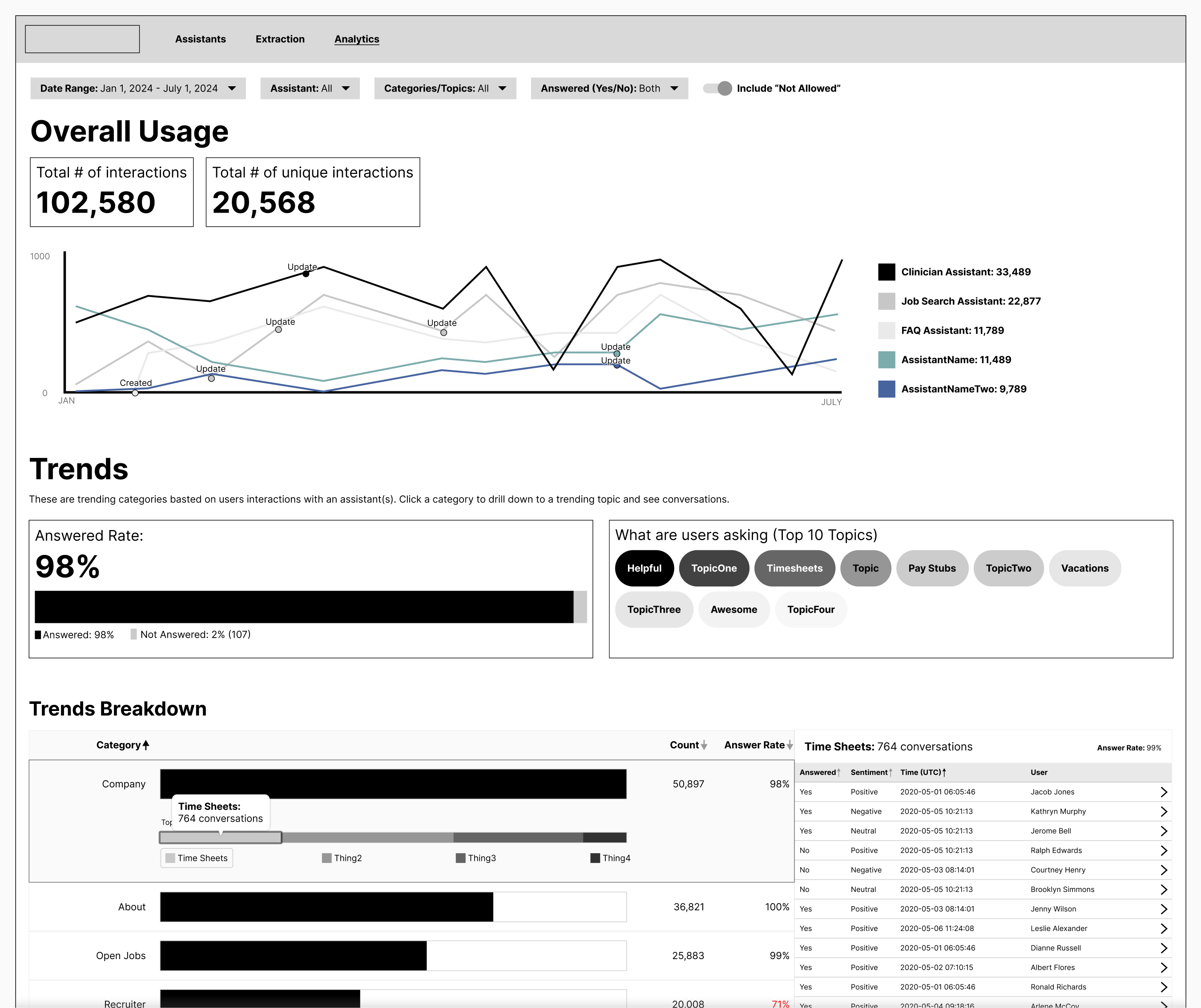
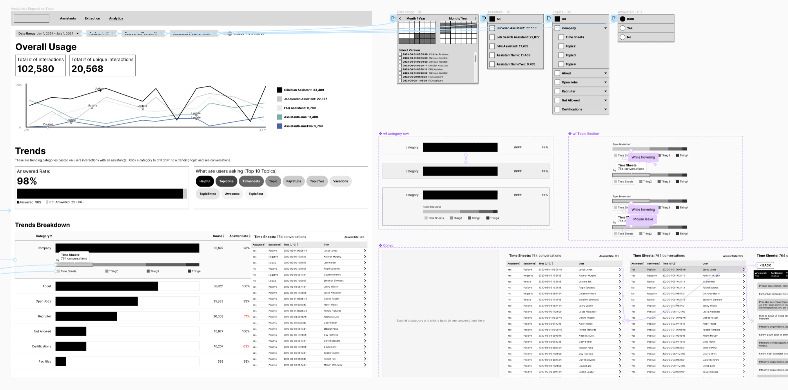
- I created a dashboard that allows users to see high-level data and drill down into tiny details.
- We had 2 months from idea, to mockup, to dev, to go live.
- This was my favorite project in my career so far. Working on a data visual project from scratch, creating a theme-able data vis color palette, and collaborating with dev daily has been so much fun.
Why did we do this?
We created an app that allowed others in the company to create their own AI chat assistants. Now, we needed a way to capture the data to help fine-tune the assistants.
What was my role?
UI/UX Design, Data Visualization, prototyping, theme styling, and creating components in Figma.
How it started
The analytics portion of this app started out with users asking us questions about the performance of their assistants. It was also obvious that having analytics on this would be beneficial for developers, prompt writers, developers, leadership, and more. So, this idea got greenlit very quickly. The PM on this project was ambitious and set an MVP date for this to be live in about two months.
Research
Since this was an internal-facing tool meant for product teams, we simply asked them what they wanted to see data on. Then, we met with our developers to find out what they wanted to see data on. Then, we discussed what we could realistically do in our timeframe.
First iteration
I was very excited to be working on a data vis project again. Especially one where we weren’t dependent on a visual library or other data software. I had free reign!
My goal was to get a first draft to our team to review within 2 days.
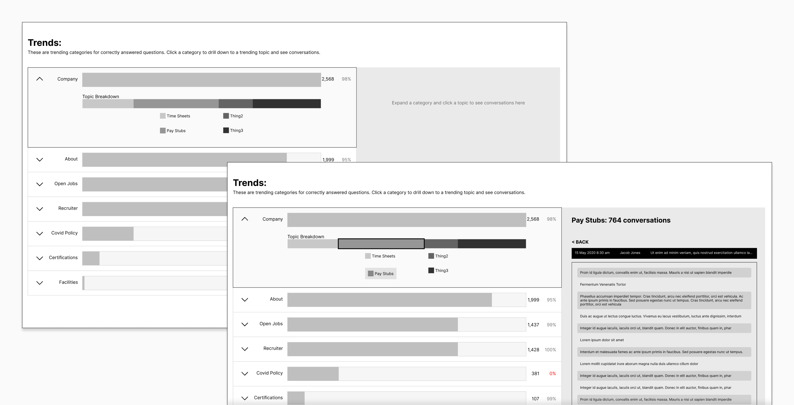
Second iteration
The PM, the dev, and I met to review my first draft. Overall, we felt confident we could proceed down the path I had laid out. With a list of edits and things to add, I went to work on a second iteration with plans to meet the next day.
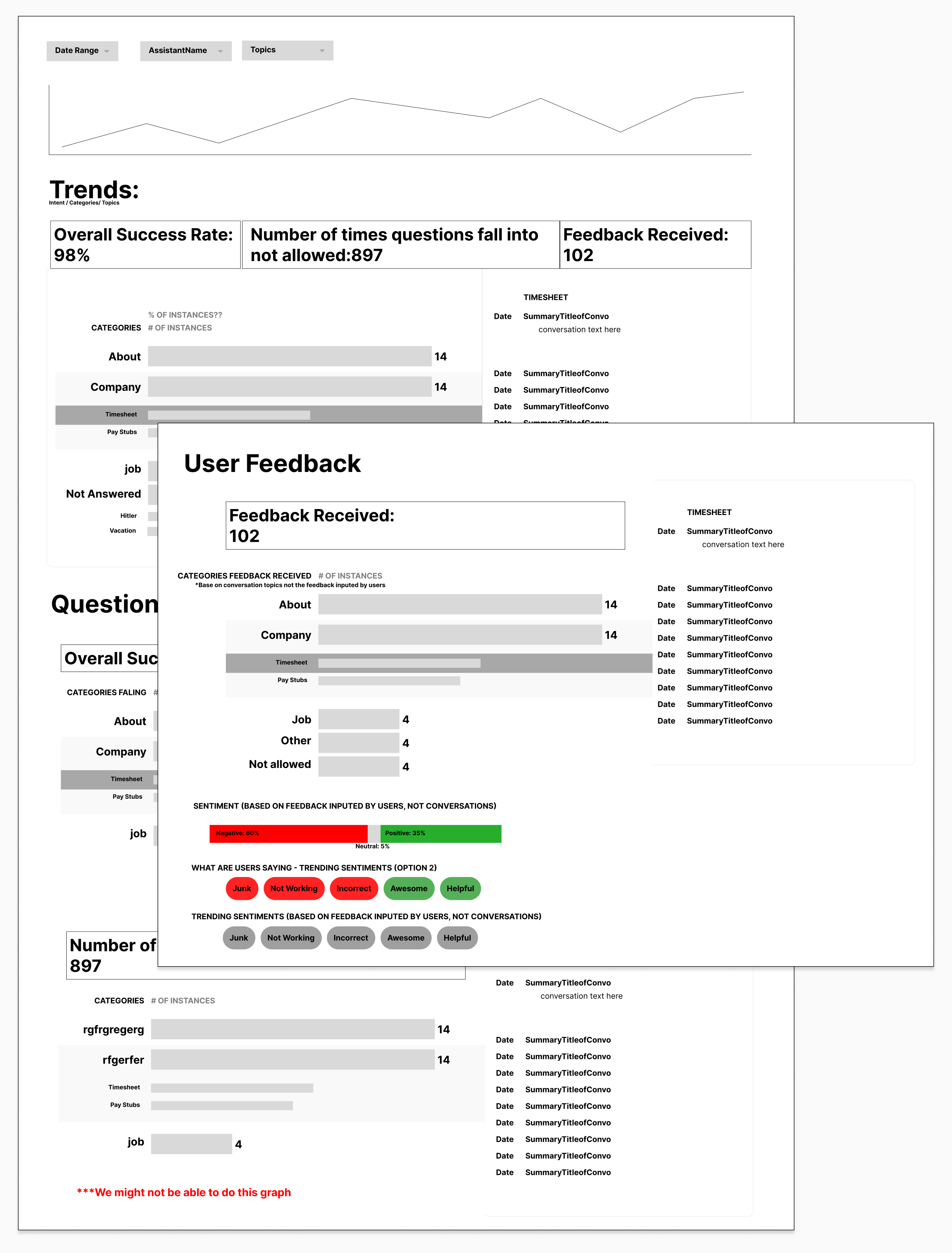
Third iteration
We met again, this time to get into the weeds. We defined our vocabulary and were a little more serious about how this would function and what role groups could see what data. As we defined these things, I took this as a chance to create our first draft of an FAQ.
With a list of more changes, I began my next iteration.
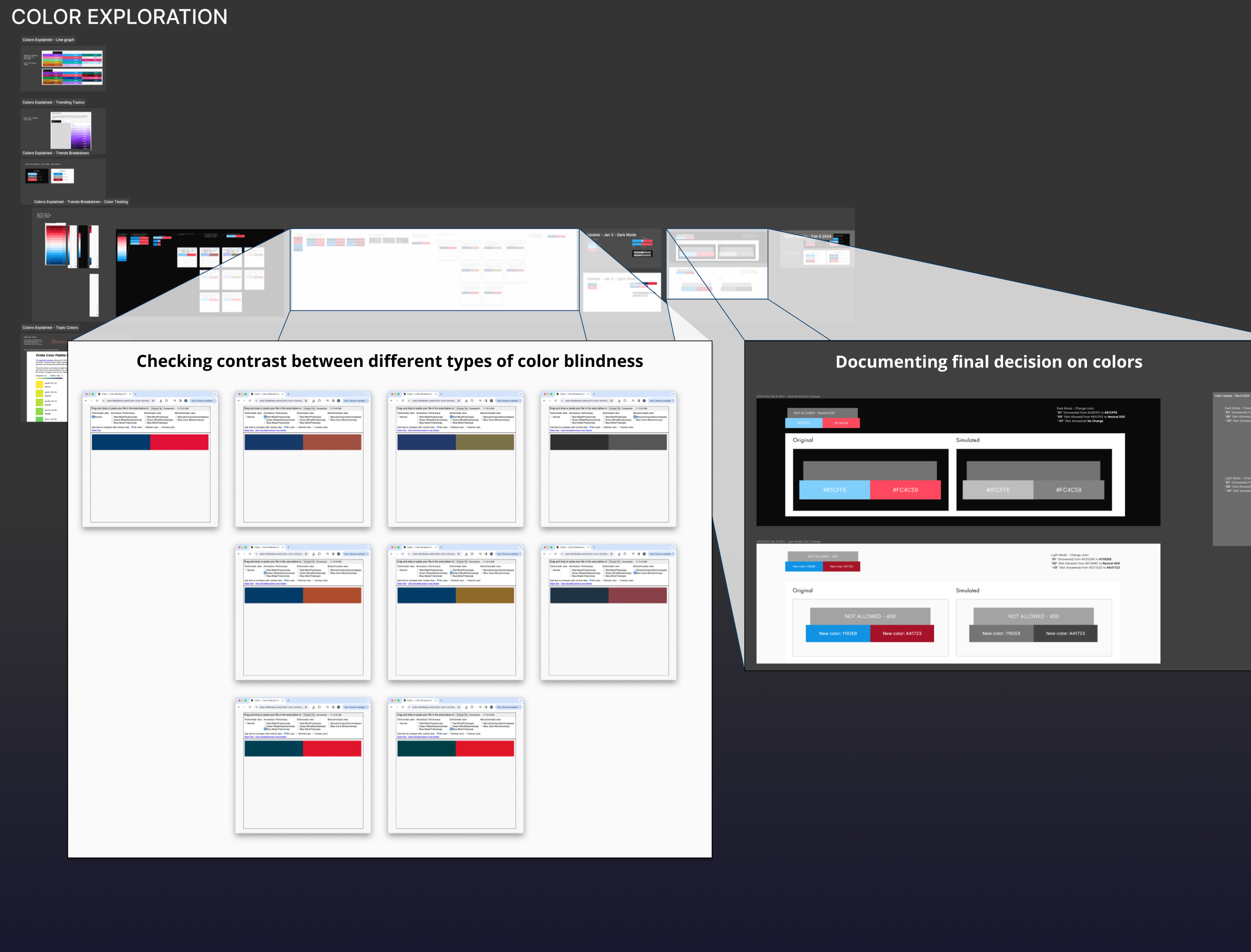
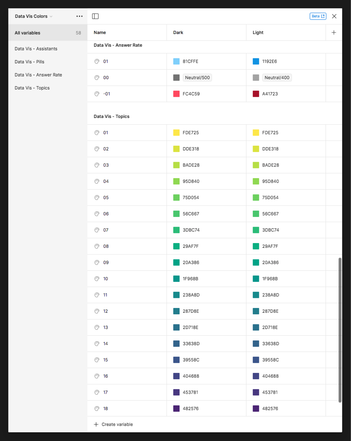
Data vis colors
I’ve lost count of what iteration we were on by this point because we were meeting daily and sometimes multiple times a day throughout most of this project. As the iteration continued, it was now time to move on to higher fidelity mockups. I started with the daunting task of picking the data vis colors. What made this more daunting was that this was my first time choosing colors that had to work in multiple themes.
Since the analytics are internally facing, we didn’t have to worry about matching any company-branded colors. Plus, we needed to move fast, so I opted to lean on other experts who already spent a lot of time crafting a well-designed color palette. I ended up borrowing the colors from the Carbon Design System.
My next mission was to take those predefined colors and ensure they were accessible in both light and dark modes.
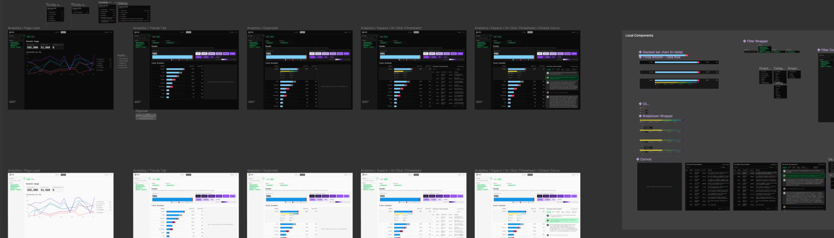
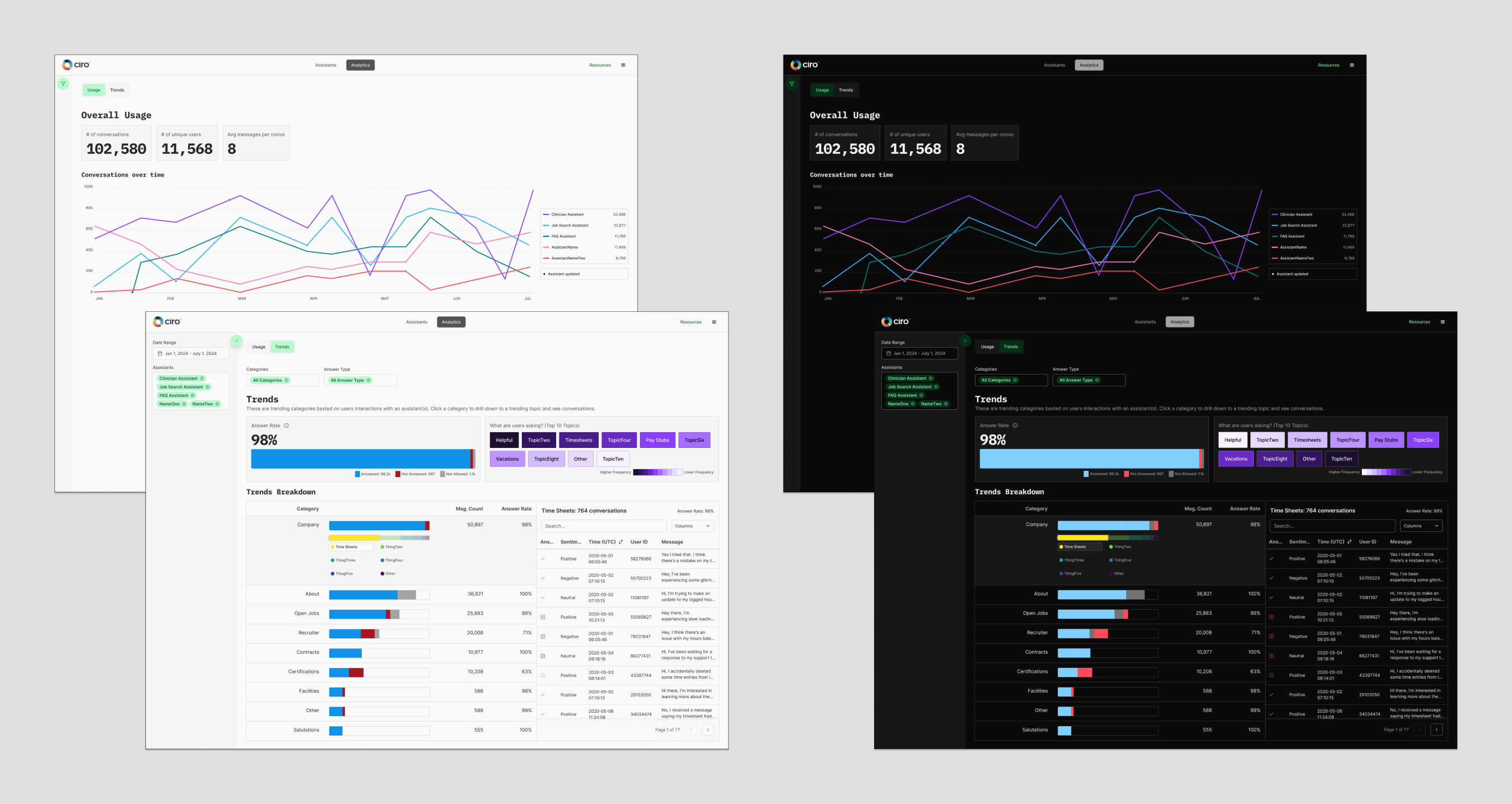
Hi-Fi
Now that I felt confident in my color choices and have documentation to back my decisions, I started making a Figma prototype. I started by creating the dark mode version and then moved on to the light mode.
All along the way, I’m getting feedback from soon-to-be users, developers, and PMs. This part of the process is about trial and error, keeping an open mind when I hear honest feedback, and sometimes asking a developer to explain some mathematical thing to you like seven times so you can hopefully articulate why a certain filter won’t work as I expect it to in my head.
Throughout this project, I had to pivot a lot, but the collaboration between Design, Dev, and PM helped launch this product on time (well, maybe like a week later than initially planned).
MVP is live now, and we expect to continue updating this once the other teams use it more.