AI Assistants
AI, UI/UX Design, Design System (Figma)
TL;DR
- I designed an app that allows people to create AI assistants (chat assistants) tailored to any data they feed it with, with no coding necessary.
- This app is intended for internal product teams within our company to create and test chat assistants within our applications that are embedded into client-facing apps. However, we have found many other uses for assistants, for both internal and external users.
- This was my first AI project, and I was scared.
- The majority of the work was completed between August 2023 - January 2024.
Why did we do this?
We did this because we all know AI is changing how products are made, and if we don’t hop on the train, we will be left behind. Our stance is that we should have a dedicated team working on AI that can lead the change while also empowering other teams to use AI in their projects. So, we set out to build an app that taps into OpenAI and allows others in our company to use AI without needing to code.
What was my role?
UI/UX Design, prototyping, branding, theme styling, and creating components in Figma.
How it started
By the time I was put on the AI team, the PM and devs were ahead of me. They had chosen their front-end frameworks and even started building some pages. It was up to me to take their proof of concept and make it a user-friendly app.
Research
At first, my research was less about users and their needs and more about figuring out what I was even working on.
I was in meetings seeing demos, hearing devs talk about AI, and they were saying words I’d never heard before. I was so lost. I felt like a baby in a college class. I knew I had to get up to speed quickly, or else I’d get laughed out of the Zoom calls.
I started by doing the least AI thing possible, I read a book on conversational design. Then, I took an online course on AI. Then, I watched any video that had “AI” in the title. Then, I read any article that mentioned AI.
I shared how we can use the things I had learned in our product. Taking those 2 weeks to really understand the state of AI was already paying off.
First iteration
Now, I’m ready to focus on what the devs have created. I need to understand what they have already put out there. So, I did an exercise where I took the sections of a page and played around with it until I could understand what it was doing..
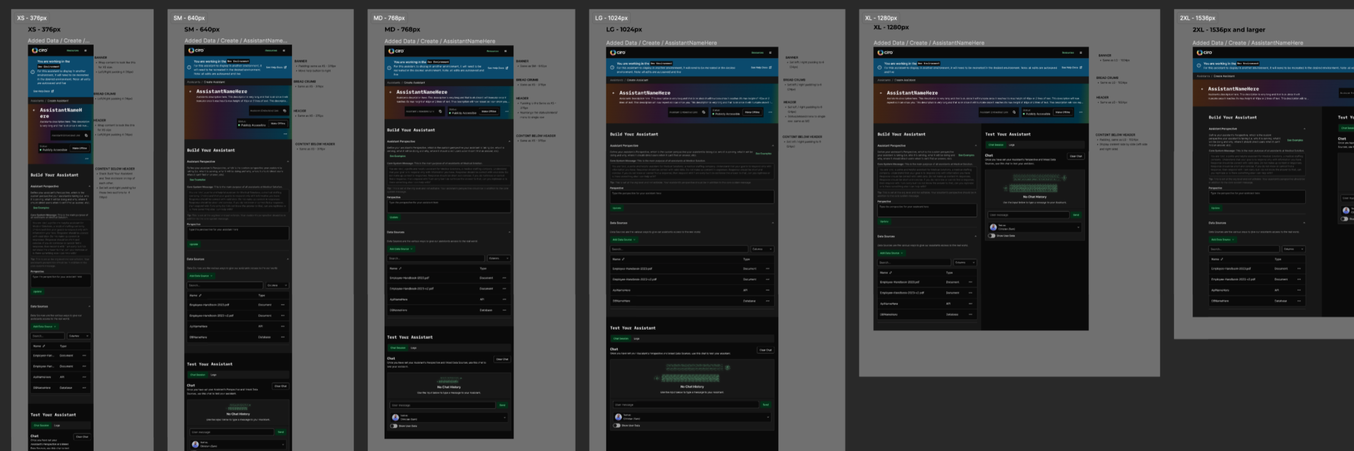
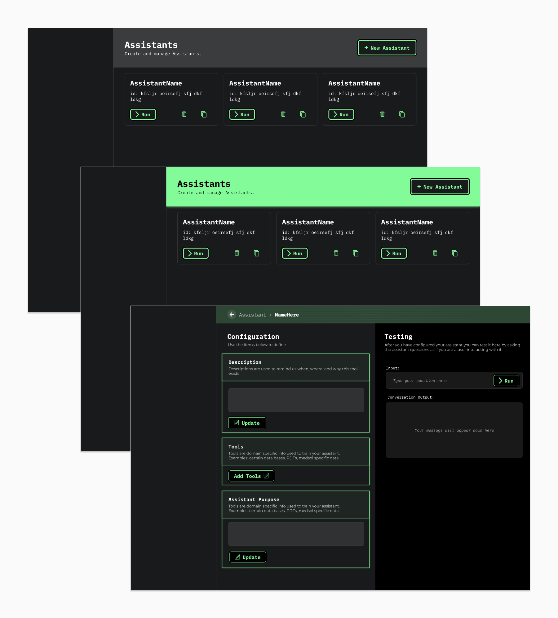
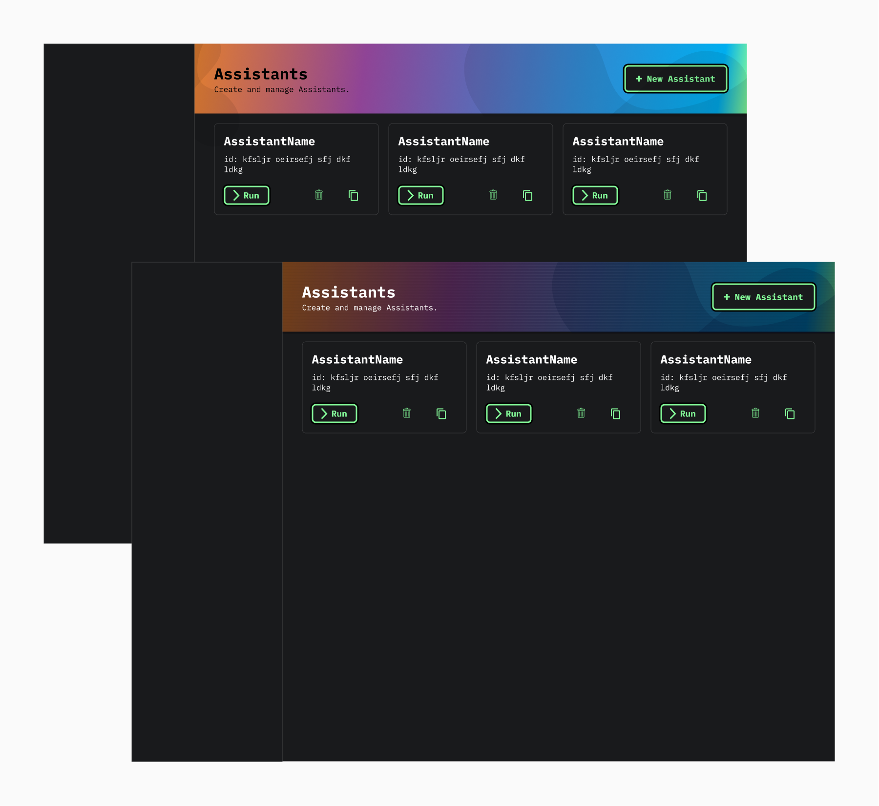
Then, I wired-framed the page using the existing content and rearranged it in a way that best fit the flow of how users would interact with it.
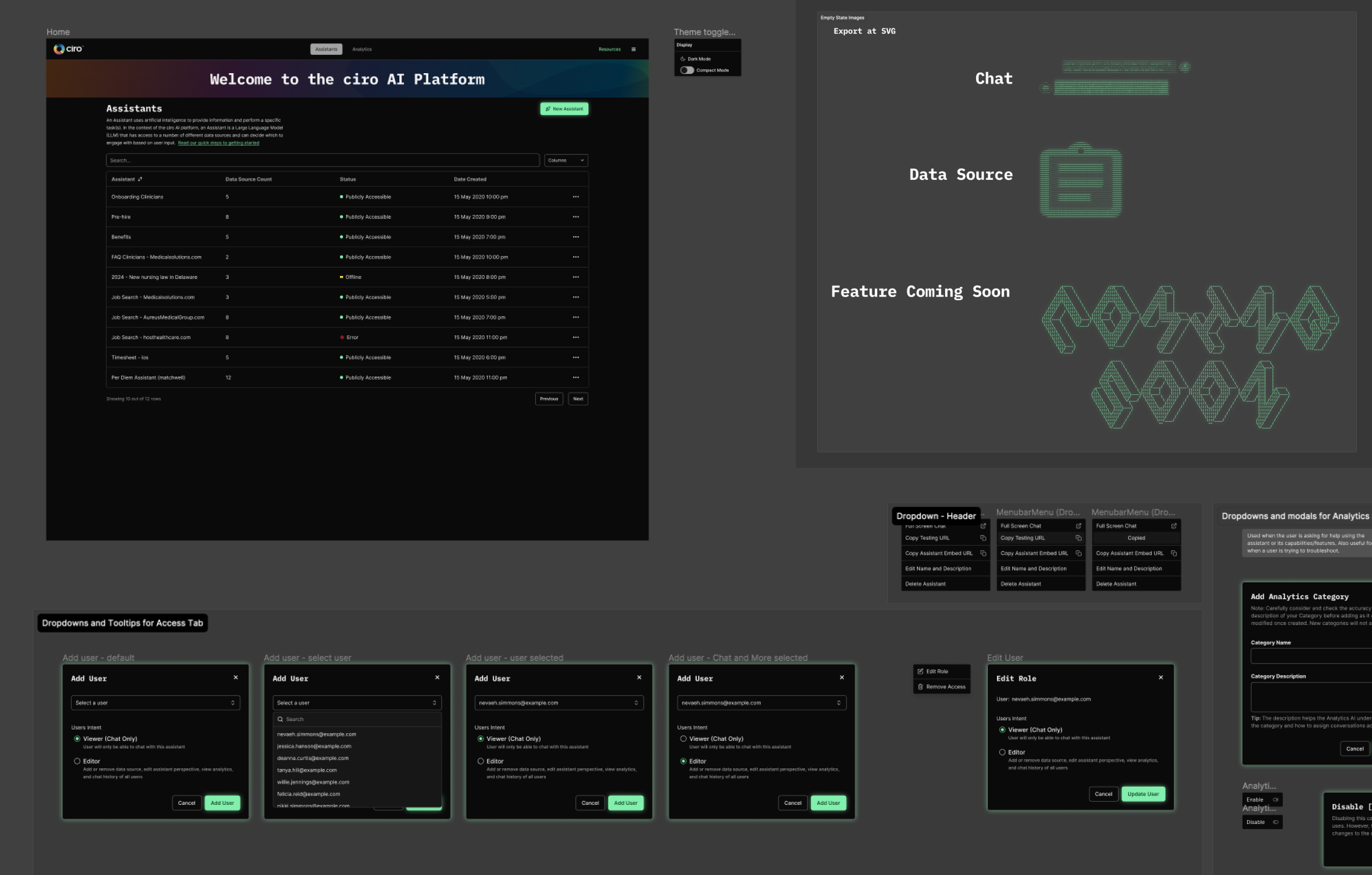
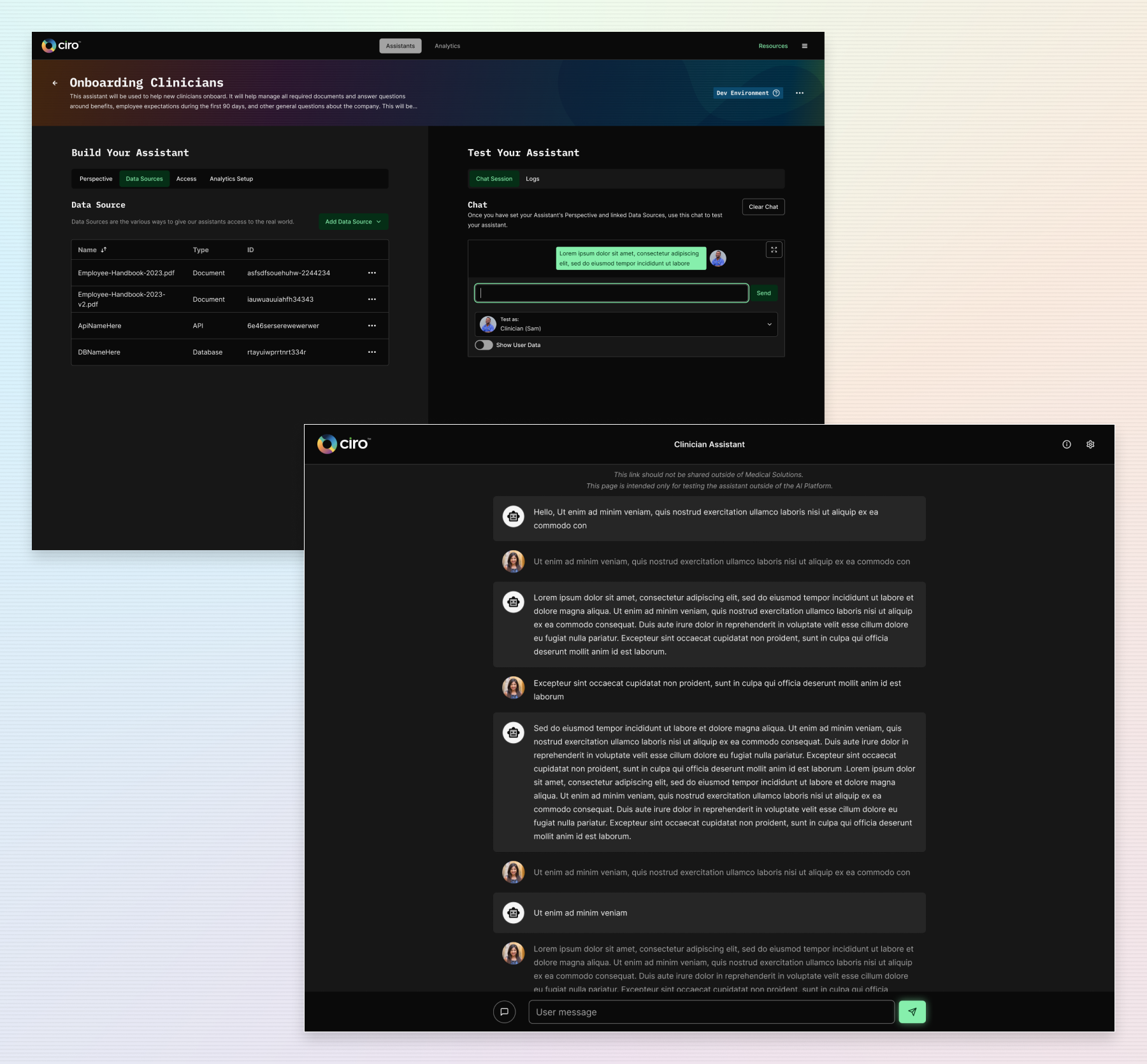
I started by grouping all chat UI into a column and all of the configuration UI into another column, creating a clear distinction between creating your assistant and chatting/testing your assistant.
As I asked around, it seemed like testing an assistant was just as important as configuring it. So, I opted to make the 2 columns 50% wide each.
Making big moves
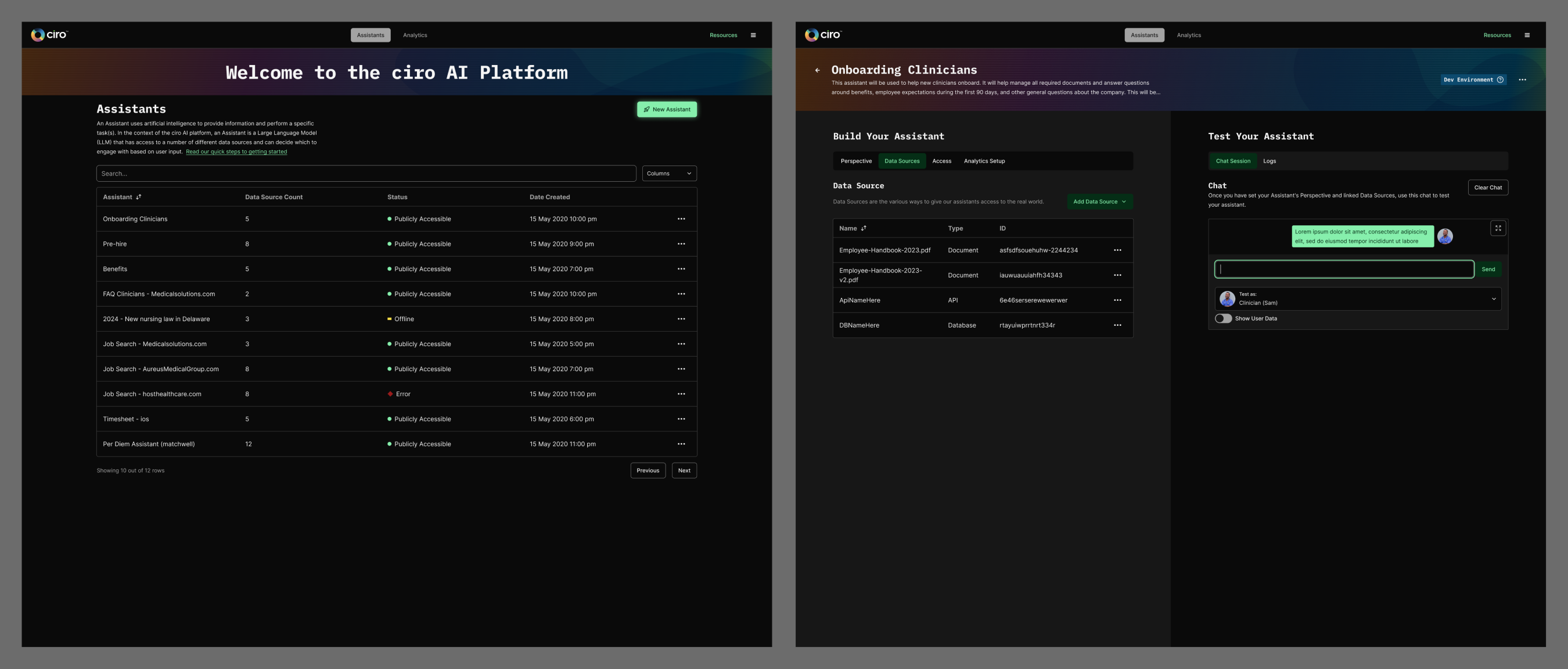
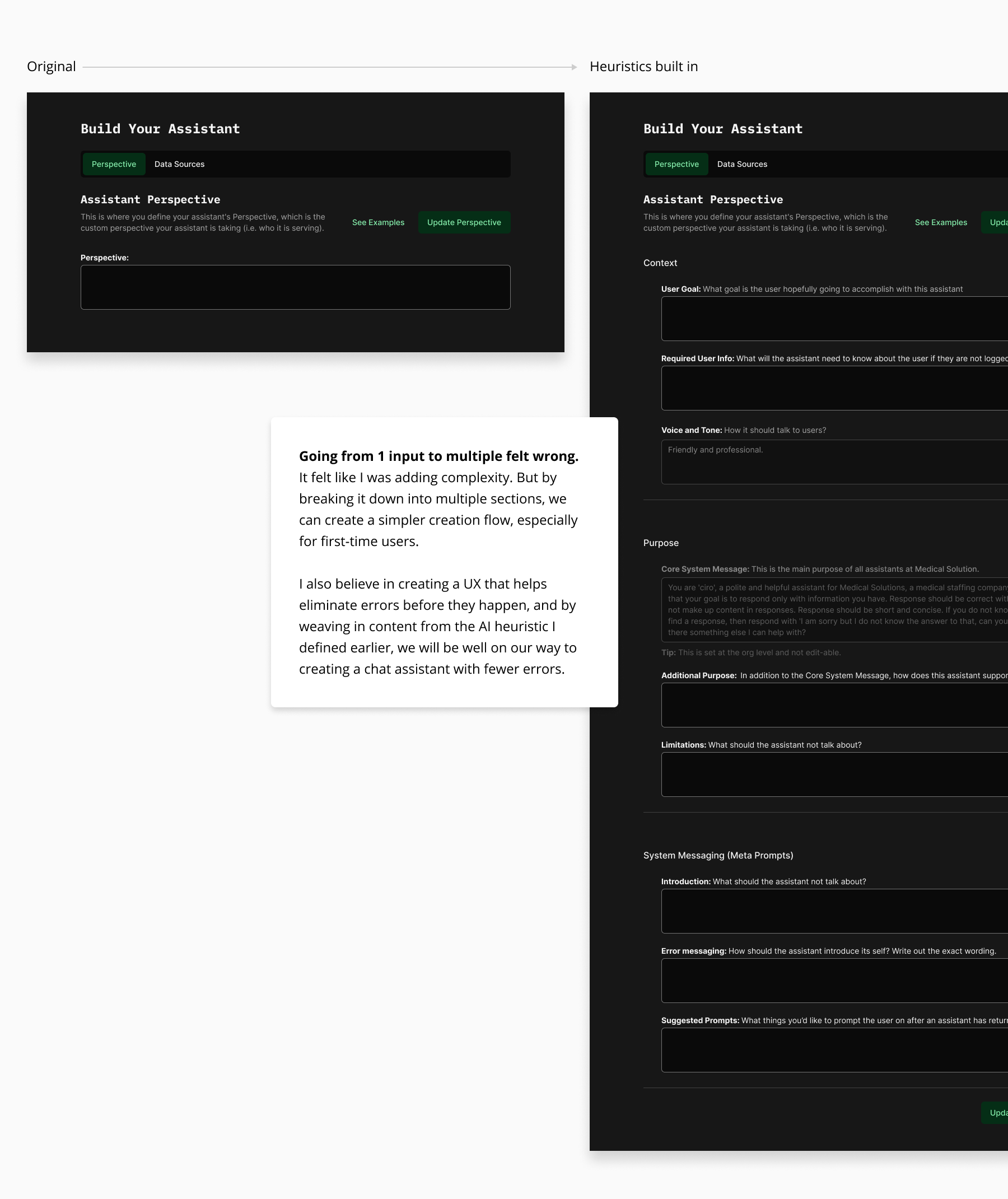
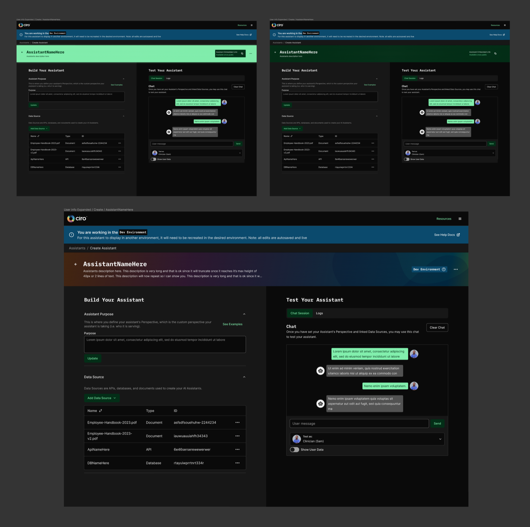
I’d meet regularly and always get feedback on my mockups. So, mockups are changing rapidly, but I’m now getting to the point where I feel comfortable adding to the UI. With my past research in mind, I wanted to make big changes to how the user configures an assistant. I wanted to make sure we were making UI that would make it less likely for a user to fail.
I started by creating my own list of AI Heuristics, something similar to the UX Heuristics but reimagined by taking my learnings on AI. I made a form with the intent that people creating an assistant could use it to analyze their assistants before they went to production. But as I was building the PDF, I realized we could accomplish most of these heuristics in the Assistant Builder and guide the user in creating a better assistant right out of the box.
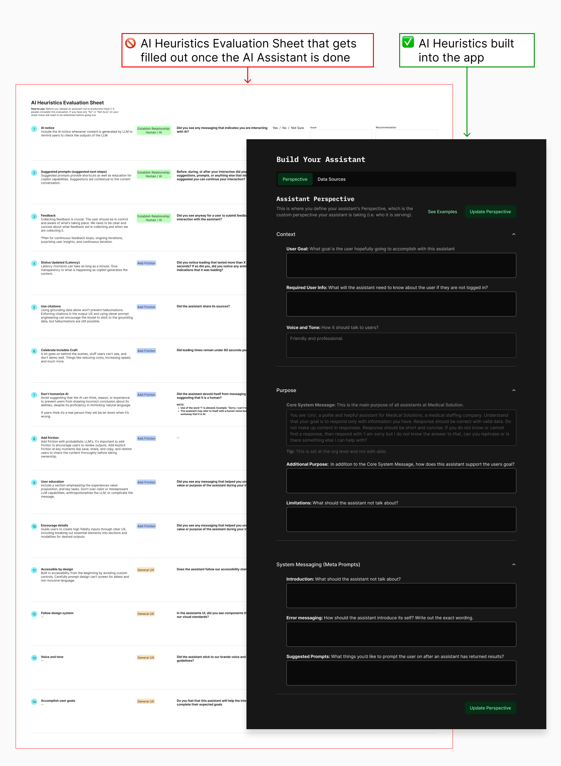
This mainly involved taking one generic text area and breaking it down into the multiple aspects needed to meet the heuristics list.
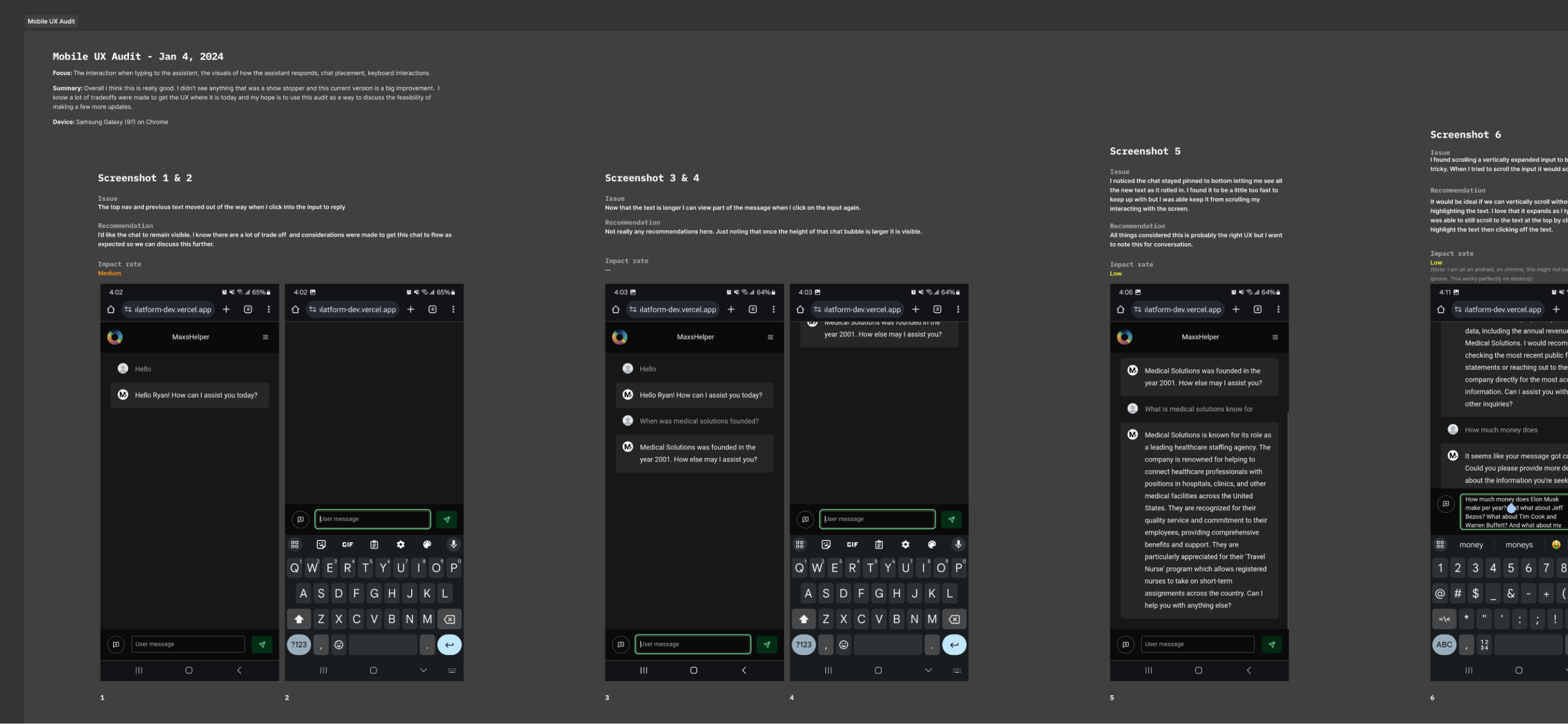
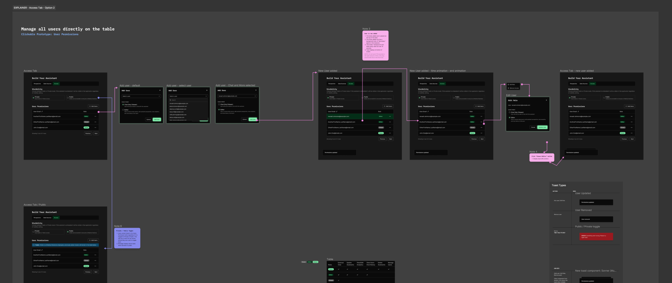
User Testing
As the weeks went on, I did some very low-key user testing, simply asking people who had never seen the mockups and had limited knowledge of our project to create an assistant themselves.
We did this several times, and the entire team felt confident sharing the app with people who would actually use it. We received some great feedback from them and made some changes based on their input.
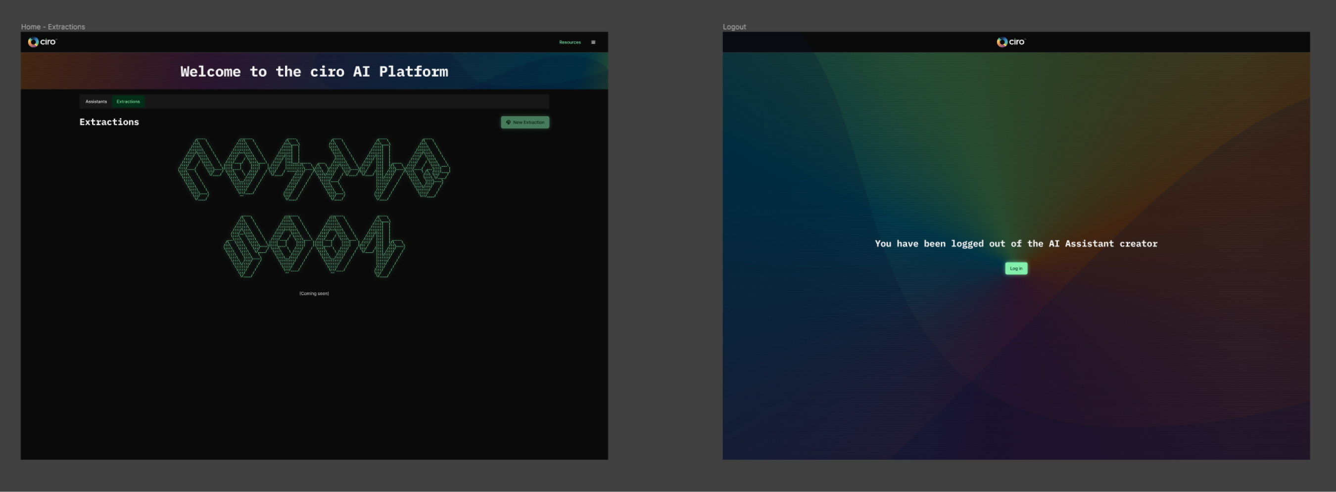
The AI Assistant Builder is now in production. While small changes still happen here and there, we are now moving on to other aspects of AI besides chat.
Styling and branding
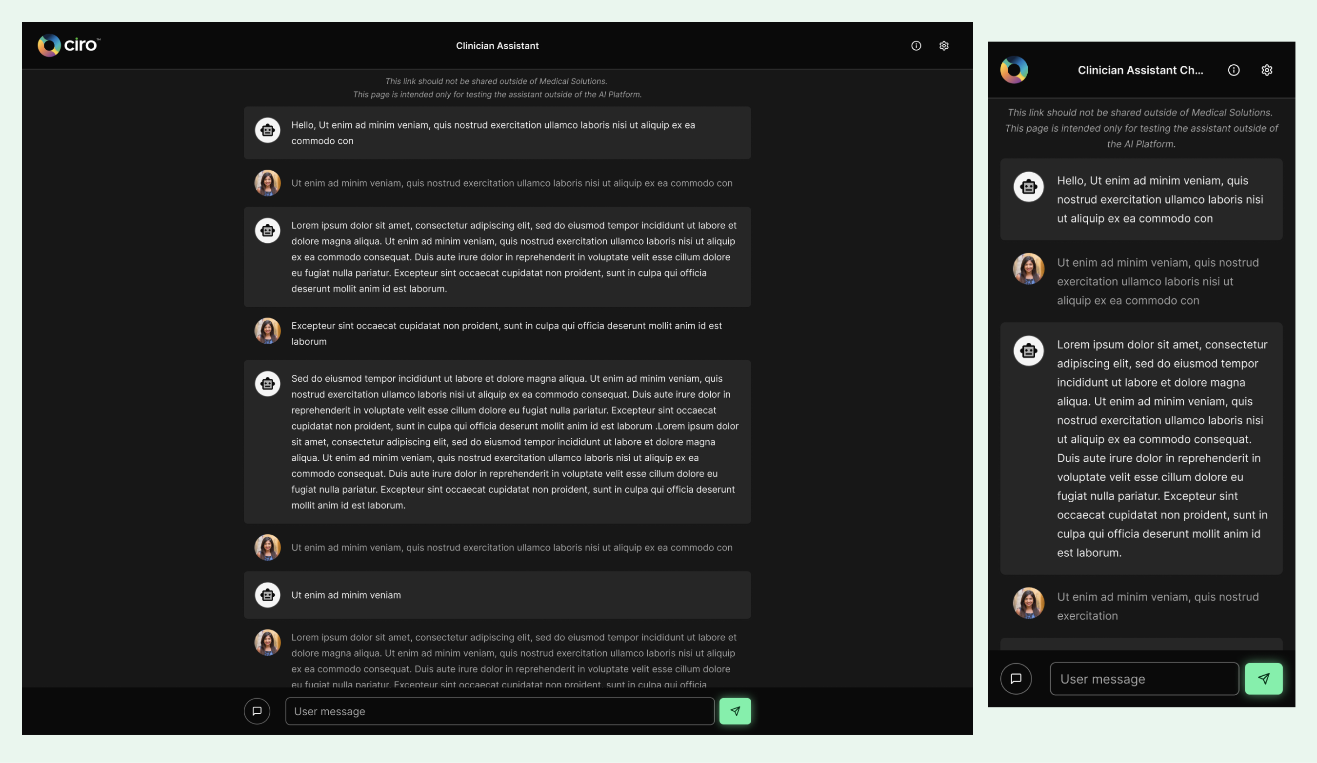
This was an internal facing app, so I was told I could have fun and make this whatever I wanted. Very early on, I had this idea of borrowing elements from retro computers with green text and black screens. So, my first iterations were around playing with monotone color palettes.
To my surprise, this style was not widely liked by anyone on the team. So, I went back to the drawing board and tried to create a more pleasing color palette.
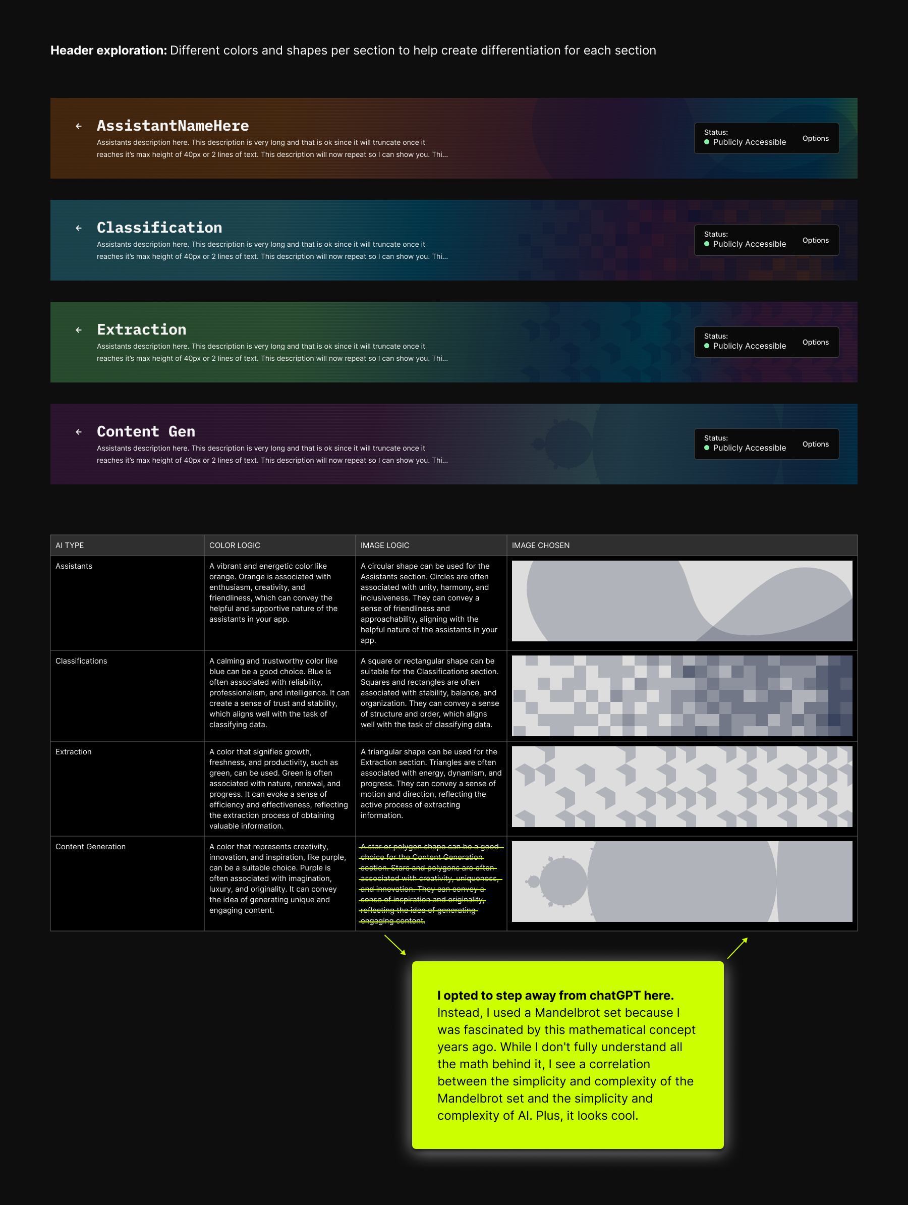
Eventually, I landed on a balance of retro and more representative of our team by taking colors and shapes from our team logo.
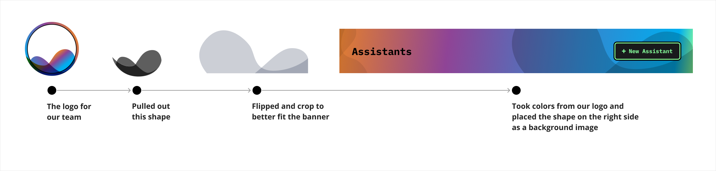
As I was creating the banner, I wanted to make a design that could be switched up to indicate that the user is working in different parts of the app. So, with the help of chatGPT, I crafted logic that led my design decisions when creating the banners for other parts of that app.
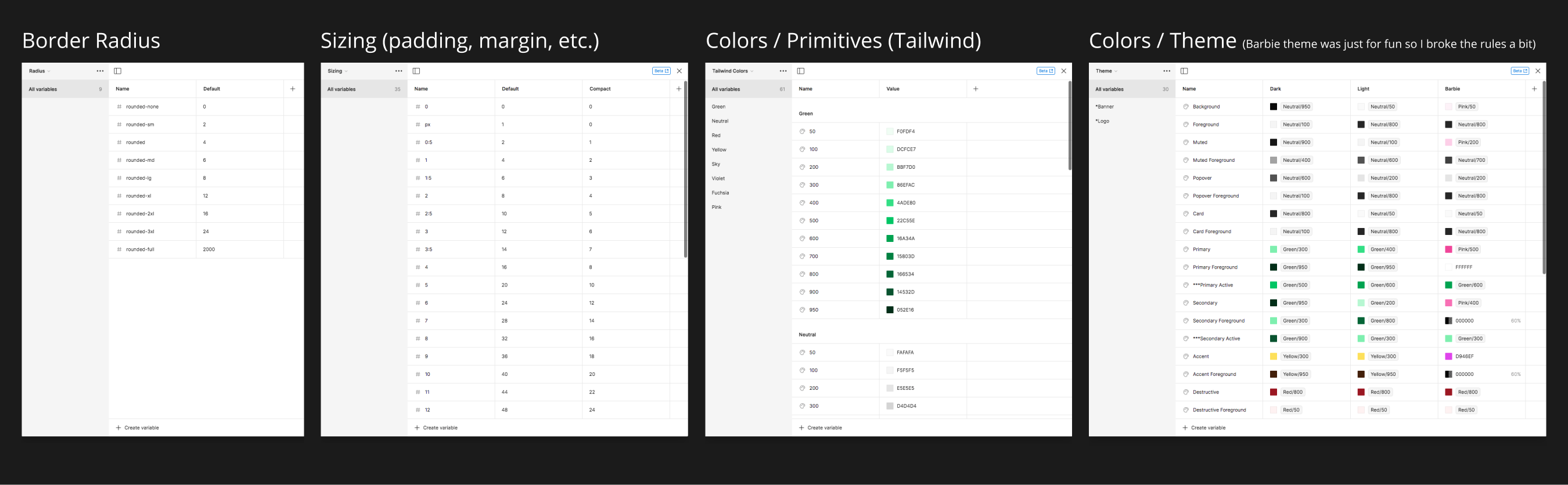
Design System
Now that I had a basic idea of how I wanted this to look, I began to think about how I could make ShadCN (the current front-end framework) match the look I was going for. Since this was my first time working with ShadCN, I decided to look through their documentation and recreate all their components from scratch in Figma. This was time-consuming and took over a week. I'm sure I could have just used the provided Figma file, but learning every pixel of every component and how learning theming affects each element allows me to make changes faster.
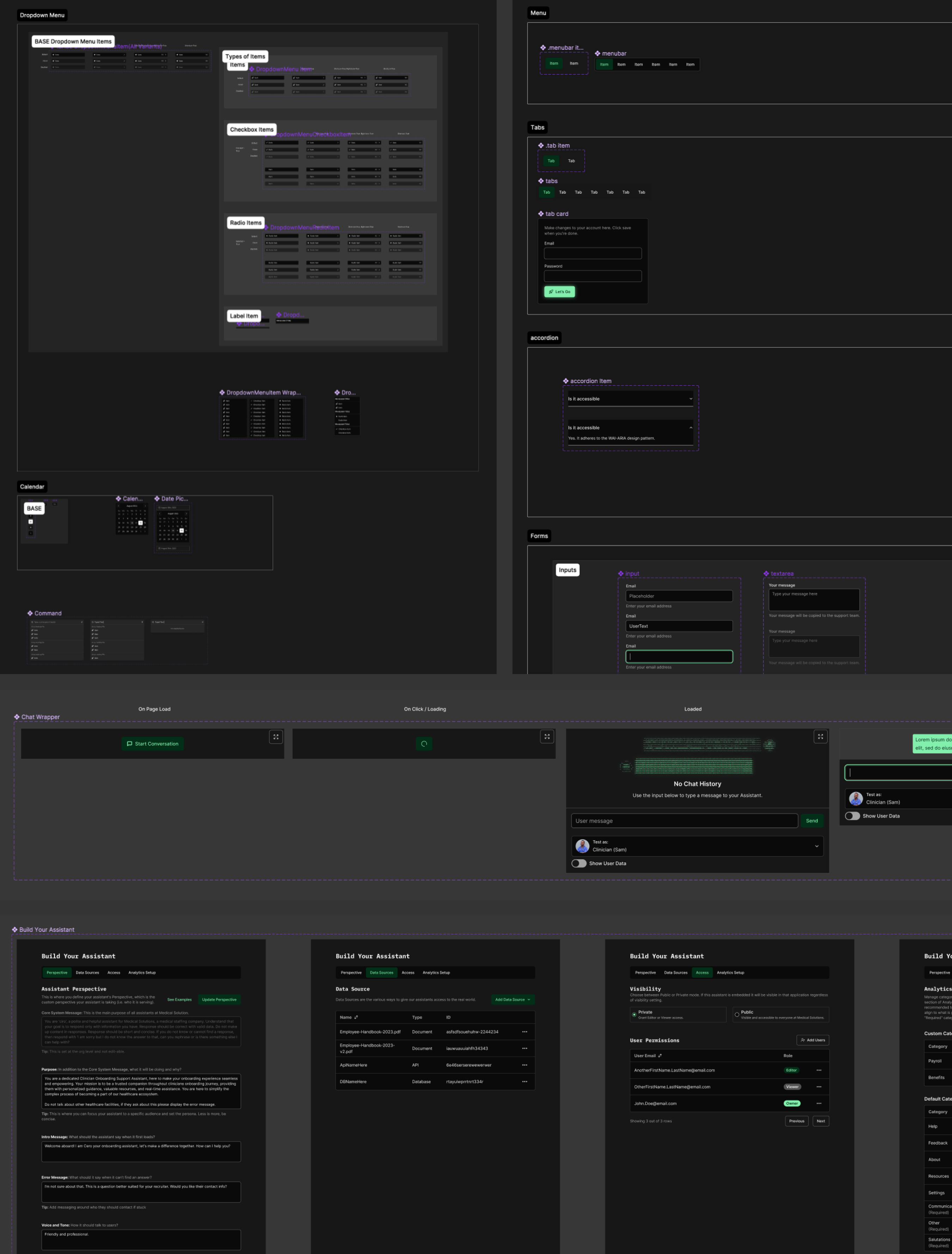
At some point, while making this in Figma, they rolled out Variables, so now was the time to ensure all padding, margin, border-radius, and colors were themeable.
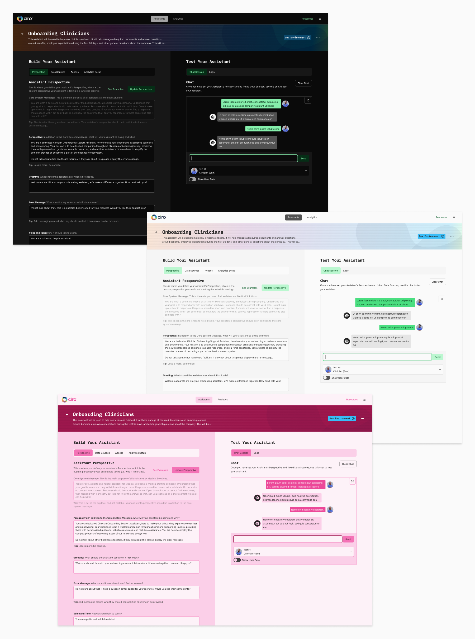
Design fast, code fast
Now that I'm using ShadCN components to create mockups, I can *almost* drag and drop my layouts together. I'm also trying my best not to design anything that will require developers to create custom code.
Once the developers got to building the mockups, they mentioned how quickly they could build the front end since they weren't writing custom HTML and CSS.
Since theaming my UI design is still a bit of a new concept I had fun playing around with Light, Dark, and Barbie Mode.
I know I'm brushing over a lot here, but I'll wrap this up with some more screenshots. I'm always happy to talk about this more just hit me up.