WageWise
Product Design, Prototyping
TL;DR
- This project was about validating an idea centered around pay transparency.
- Our small team was given little direction on where to start, which provided a lot of freedom to find the best way to solve it
- Through user interviews, user testing, and many iterations, we are well on our way to creating a new way to search for travel nursing jobs.
- Project date: April 2023 to present.
Why did we do this?
The company identified that more needed to be done around pay transparency. Our team had to figure out how to make this happen.
What was my role?
Product Design, prototyping, understanding user needs, branding, design system creation, presenting prototypes for exec buy-in.
How it started
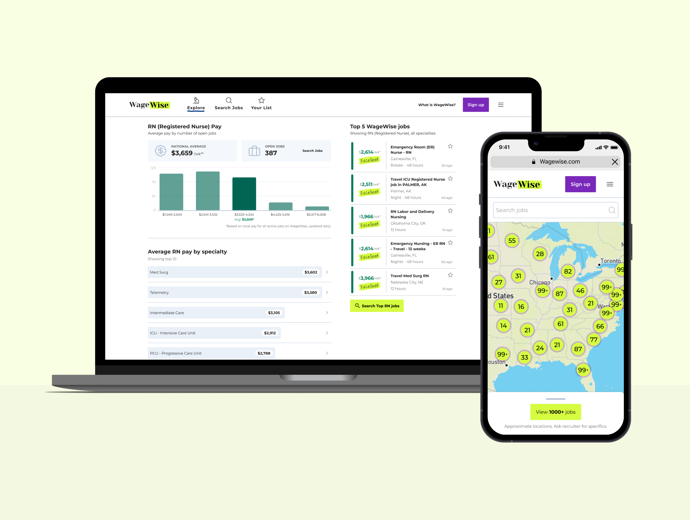
WageWise is an app that provides pay transparency to travel nurses. We do this by aggregating many travel nursing agency jobs into one job board, paring it with cost of living data per city, ranking a job to the average pay for similar roles, and providing a simple score for each job posting.
Before I started in my role, our VP of Innovation and another PM had done some preliminary thinking and created a solid foundation for us to continue on. The PM and I now assigned to this project started on the same day and were both new to the nursing industry. So before we could take this project and run with it, we had to get to know our users.
Research
We started our user research journey by meeting with others in our company. Meeting with marketing, recruiting managers, execs, anyone willing to talk to us really.
But the best way I got to know our users was by talking to the dedicated UX Researcher at our company. They directed us to hours of interviews they had conducted. Interviews with users, non-users, nursing recruiters, and past UX studies they had conducted.
By listening to these interviews, I could hear their needs and desires and uncover some pain points that users have today.
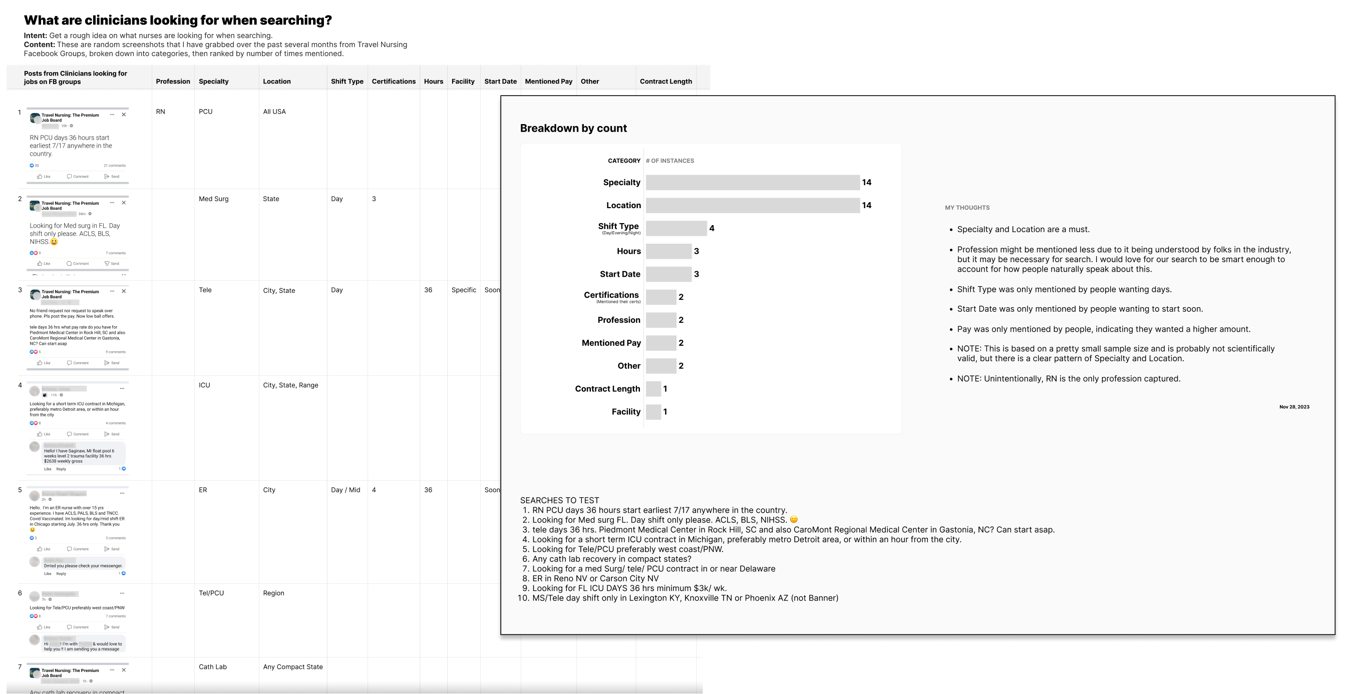
One unique detail that stood out to me from these interviews was that a nurse mentioned they are a part of travel nurse Facebook groups that talk about facilities, pay, recruiters, and more.
So, one easy way to immerse myself into the nursing world would be to join these Facebook groups as well. This became super valuable to me as I was able to gain so much insight into how they search for jobs, how they gauge pay, and how they really feel about so many things.
This became invaluable to me as I heard directly from users, shared screenshots of our target audience really talking and thinking, and created use cases for my mockups.
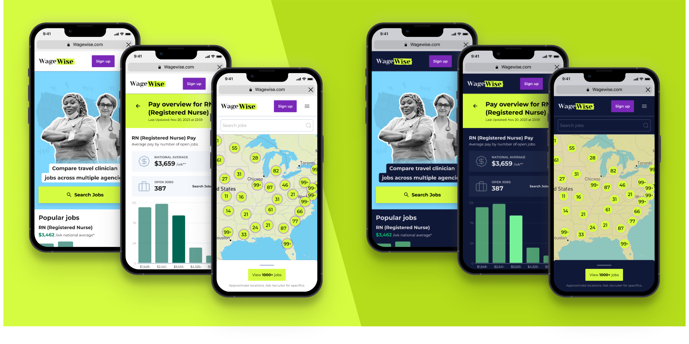
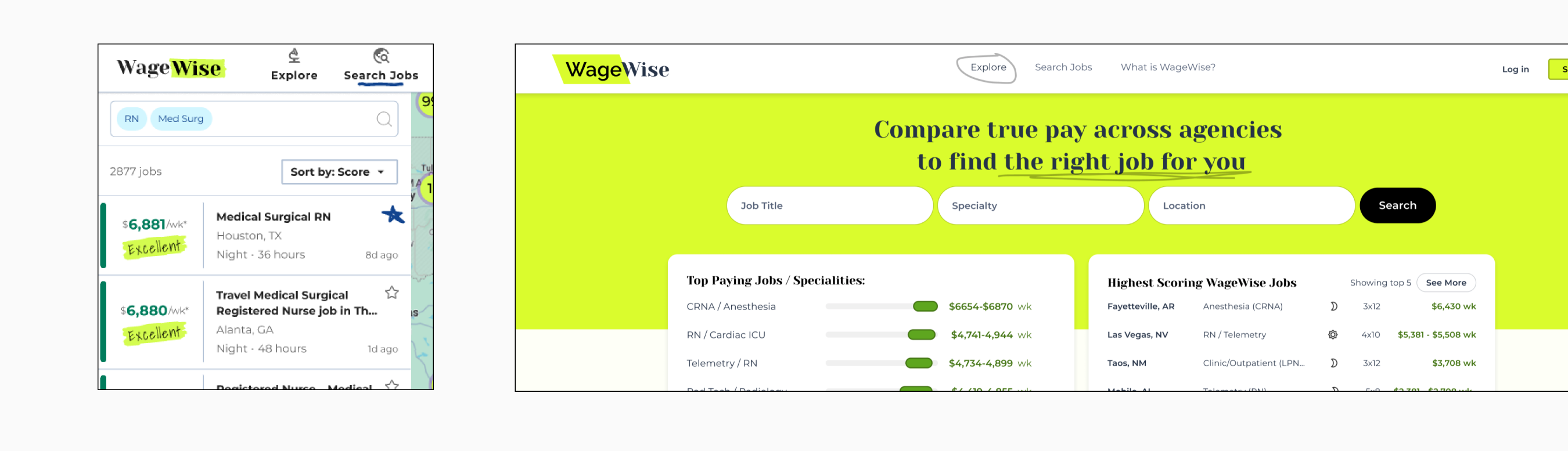
With a sense of who our users are, their needs, and the goal of pay transparency, we went to work on prototyping. This is some of the early iterations.
This version was an okay start, but we could do more.
Another thing that I learned from the UX interviews is that taking a job in a new area is a long and mentally draining process. They have to research the location, the cost of living in that part of the country, and the housing situation, to name a few. Users often spend many hours searching, with dozens of tabs open, looking at many staffing companies and keeping Google Maps open to see where these jobs are even located.
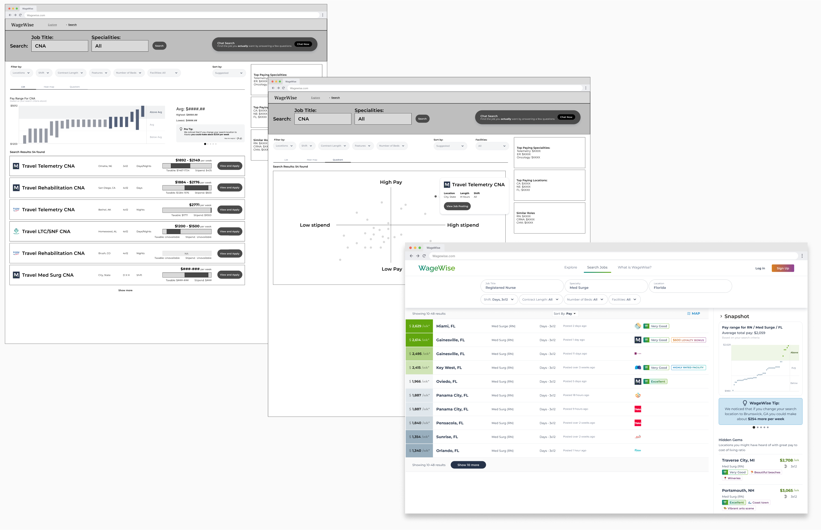
With this insight, I’m now thinking of ways to help users by limiting the tabs they need to open. Since we are already aggregating multiple sites on ours, the next big missing piece was seeing the jobs on a map. So, I created and tested a new iteration with these jobs on a map.
User testing
When testing the Table style vs the Map style, the Map truly wowed the interviewees. Overall, we got some great feedback from users. We found some spots of confusion and spots where we excelled. We felt confident enough to continue with the Map and our job-scoring algorithm.
We are making progress on the app, with our next round of user testing to be conducted in the next several weeks.
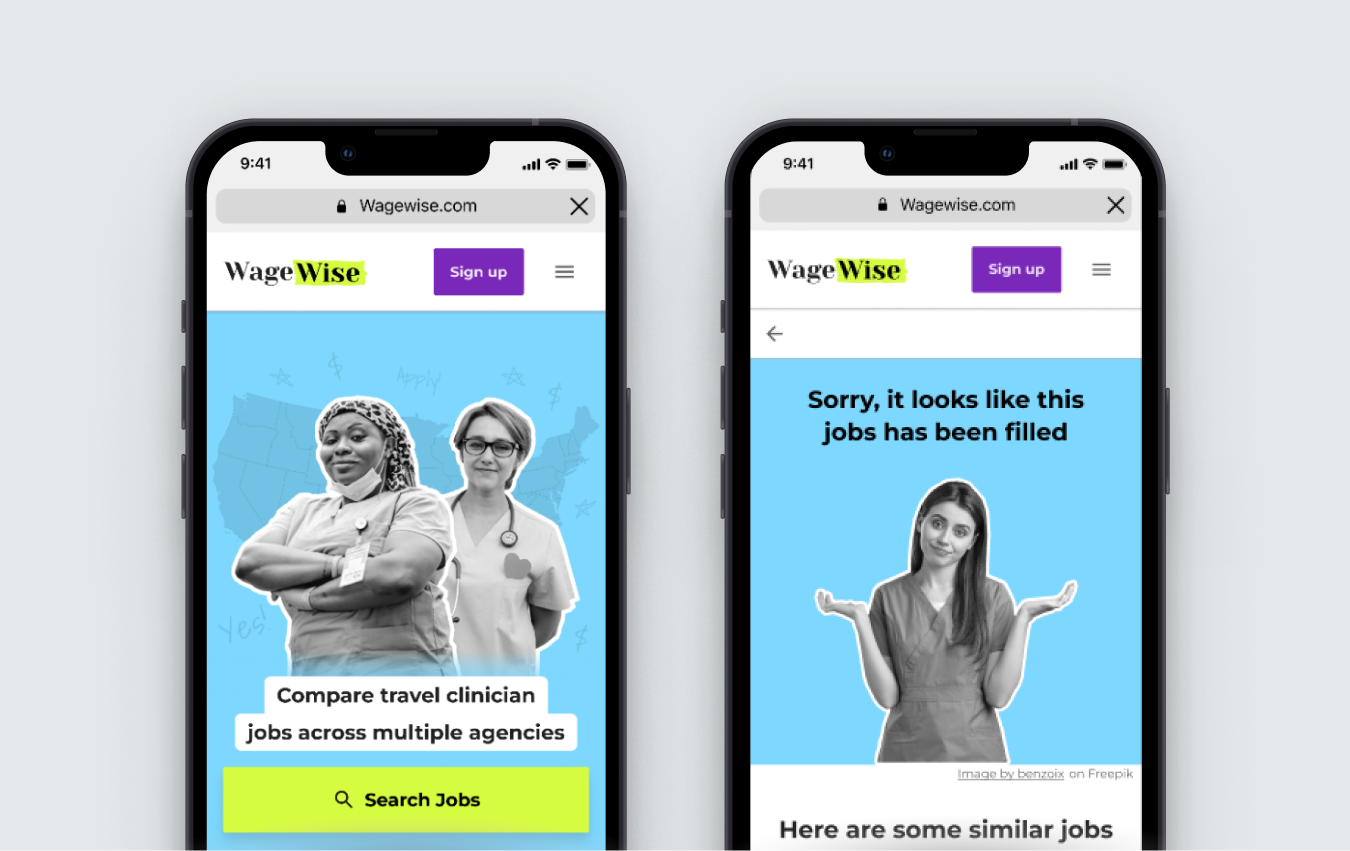
I’m still learning, iterating, and pivoting as we reach MVP state. Here are some mockups and screenshots of where we are so far. I’ll update you as I learn more.
Branding
While branding is no longer my forte, this project did allow for some branding. During early iterations and working with the PM on what WageWise could be, we noticed that the algorithm could essentially highlight the best jobs. So, I decided to play around with mimicking the highlighting of jobs like one might have done in prehistoric times on a newspaper.
I decided to lean into the hand-drawn elements. Adding them where appropriate.
I also felt like WageWise is your friend. The friend that remind you there is more to a job than money. I wanted to balance some of the data heaviness with something playful, so I added visual elements reminiscent of a newspaper cutout collage. Also, sprinkling other trendy social media aspects to keep it friendly feeling and in line with our millennial target audience.
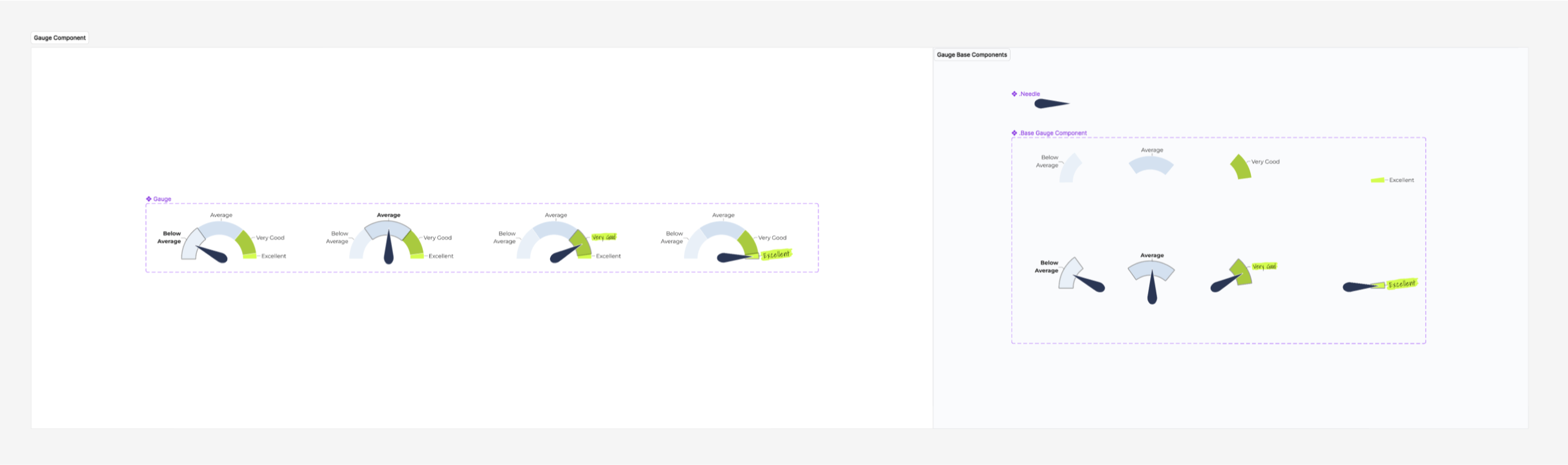
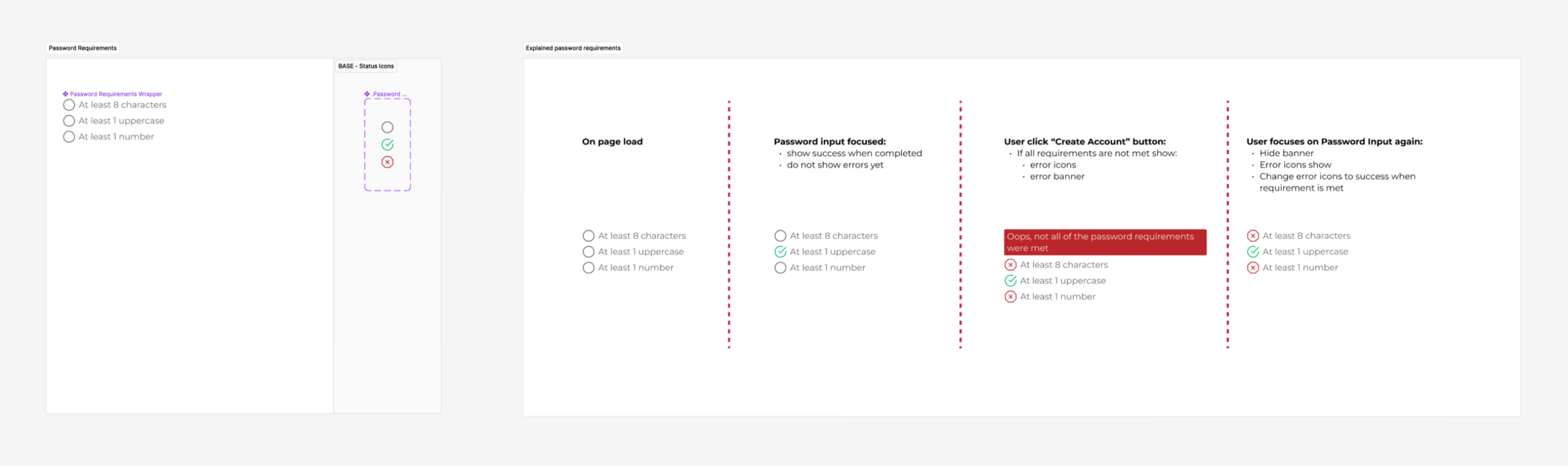
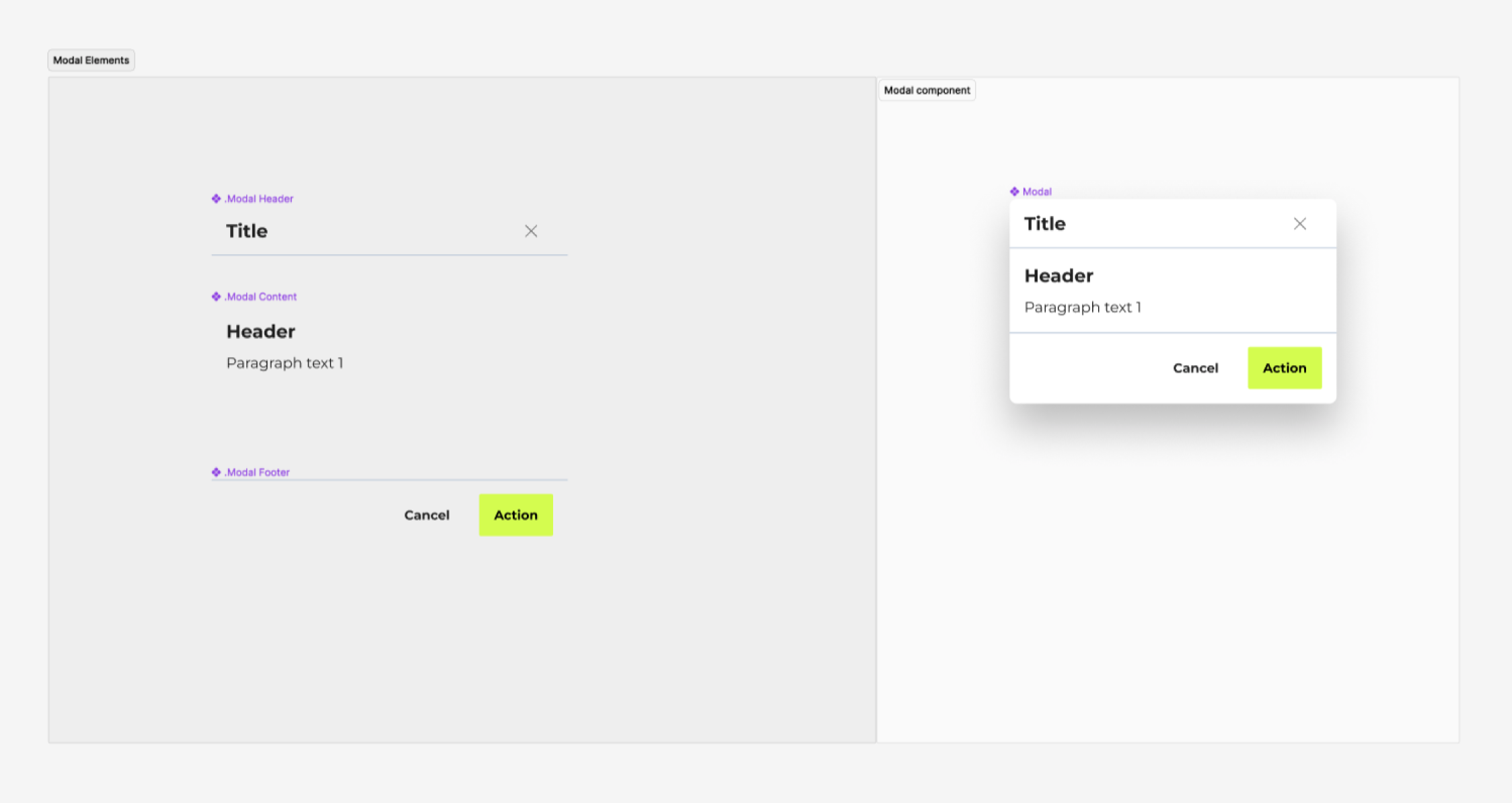
Design System
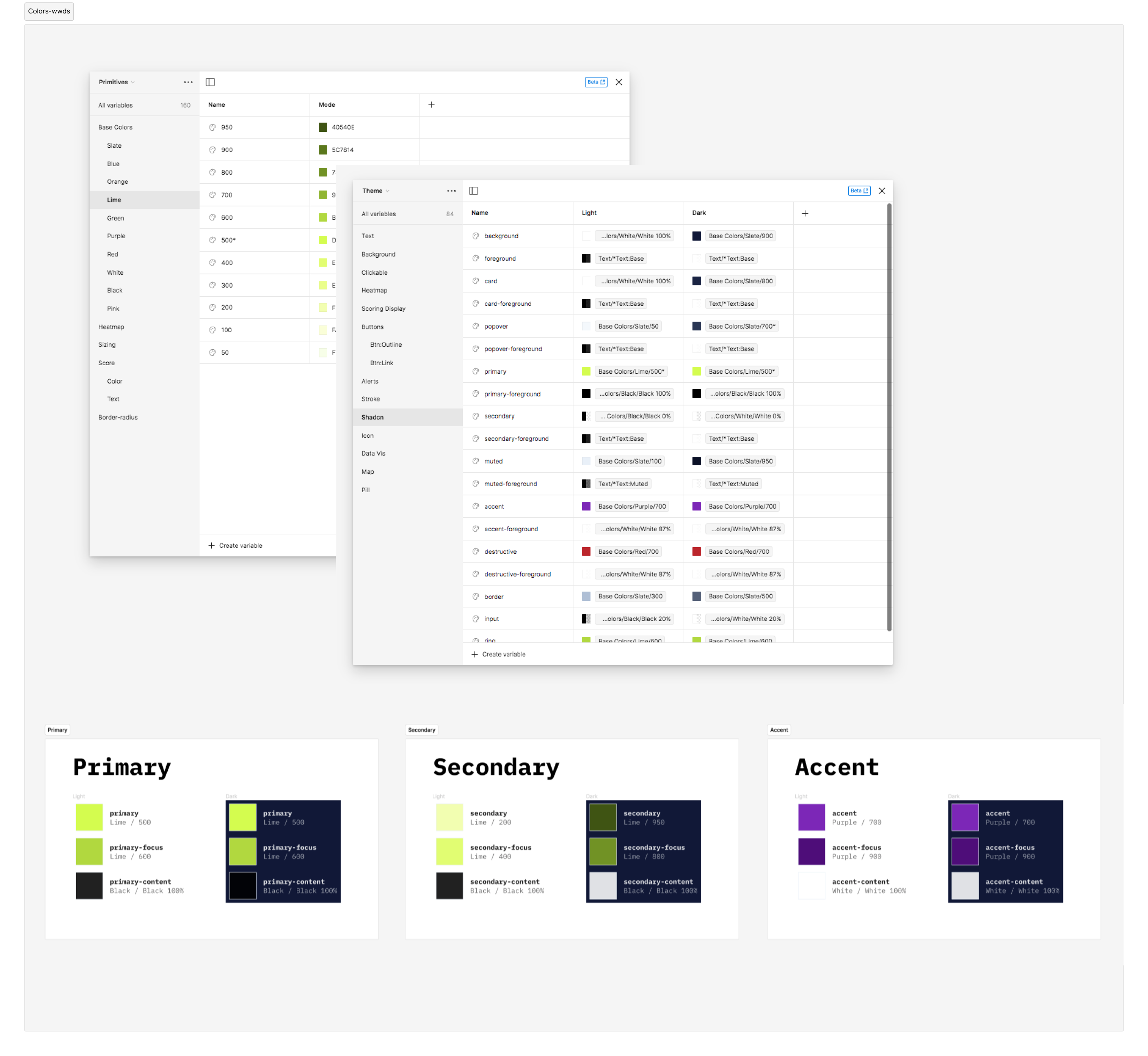
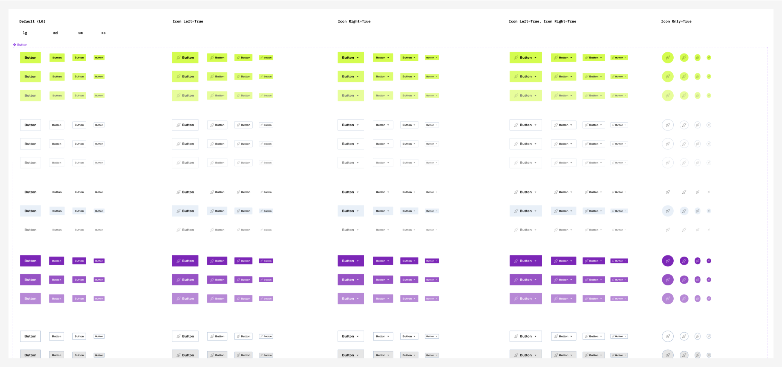
Being the sole designer working with one other FE Dev, we didn’t have the luxury of creating a fully-fledged design system that combines all the aspects of the product into one governing source of truth. Instead, we piggybacked off of ShadCN and Tailwind. However, I created a Figma version of the design system that included components and theme-able variants, documented my reasoning, and some reasoning behind certain product decisions we made along the way.
Summary
We are moving fast and staying scrappy. Keeping our ears open to feedback and making pivots daily. This is still a work in progress, and I’ll update as more comes out.